You probably have a stack like this somewhere in your kitchen. A few handwritten cards from a parent or grandparent. Printouts from food blogs. Notes scribbled on the back of grocery receipts. A binder that almost works, except the front looks temporary and the spine says nothing useful.
That's where a printable recipe book cover stops being a decorative extra and starts doing real work. A good cover makes the collection feel finished, but its true value lies in turning loose recipes into a system you'll keep using. In a kitchen, that matters more than pretty flourishes. Greasy fingers, fast shelf scanning, reprints, new sections, page protectors, and seasonal swaps all put pressure on the design.
There's a reason this category keeps showing up across major template libraries. Printable recipe book covers sit inside a broader print-and-personalization market, and the global book printing market was valued at about USD 19.7 billion in 2023 and is projected to reach roughly USD 29.0 billion by 2032 according to the verified market data referenced here. Recipe covers have also become a visible template category on major design platforms, which tells you the need is persistent, not novelty-driven.
Table of Contents
- Planning Your Recipe Book Cover Project
- Gathering and Preparing Your Cover Assets
- Designing a Clear and Compelling Layout
- Finalizing Technical Specs for Printing
- Exporting, Printing, and Assembling Your Book
- Frequently Asked Questions About Recipe Book Covers
Planning Your Recipe Book Cover Project
Most cover problems start before anyone opens Canva, Word, Pages, or Adobe Express. The trouble usually isn't design taste. It's that the cover was built with no decision about format, binding, shelf use, or how the recipe collection will grow.
If the recipes live in a three-ring binder, the cover needs different priorities than a spiral gift book. A binder cover often has to work with an insert sleeve, a visible spine label, and future expansion. A gift book can be more fixed and minimal.
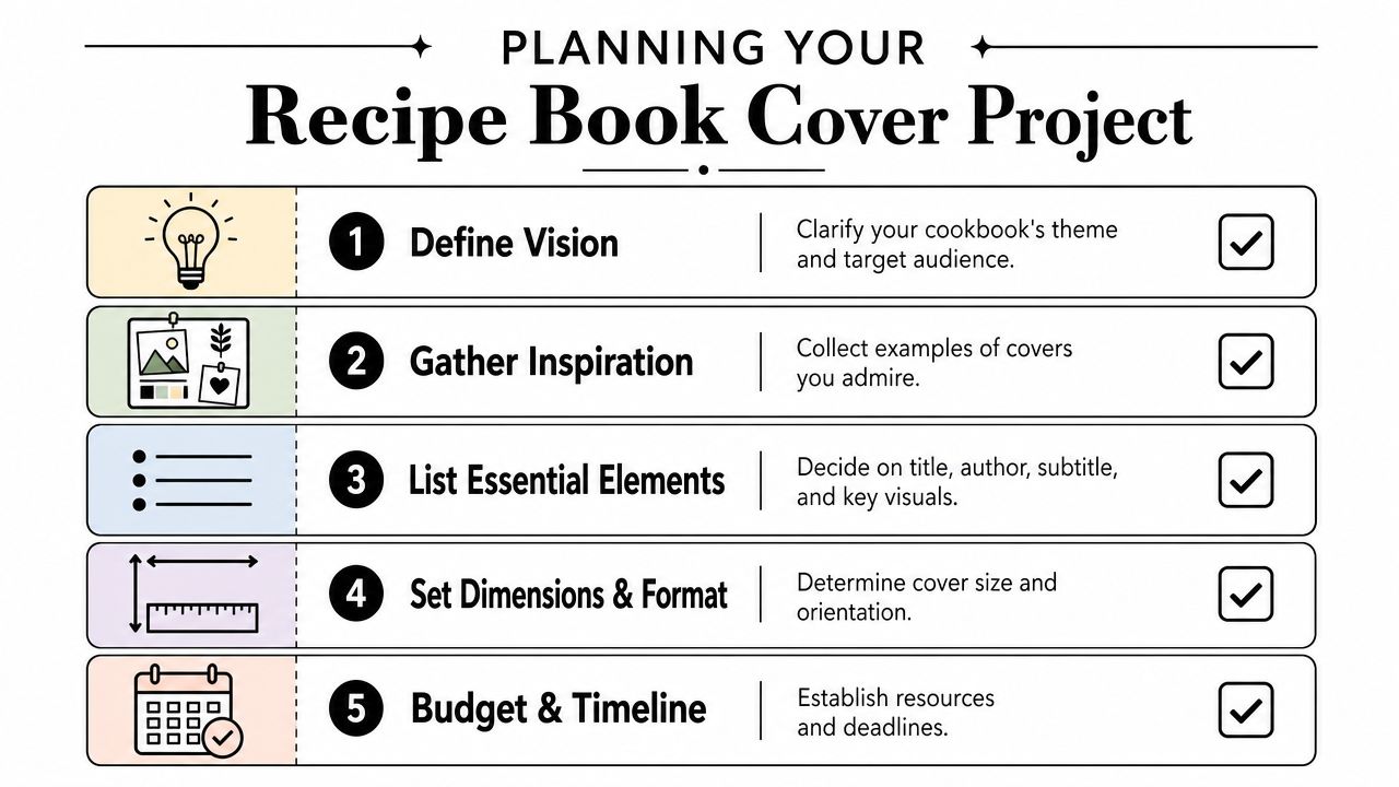
Start with the use case
Write down the answers to these before you touch the layout:
Where will the book live
On an open shelf, inside a cabinet, or on the counter. If it lives on a shelf, the spine matters almost as much as the front.How will you update it
If you add recipes often, a binder or disc-bound setup makes sense. If the collection is a finished family gift, spiral or book-style binding may suit it better.What size are you printing
Letter-size binder pages are common, but a smaller book can feel more personal and easier to handle. Design at the final trim size first, not “close enough.”Will the cover need protection
A kitchen cover should assume splatters, steam, and repeated wiping.
Practical rule: If you expect to add, remove, or reprint recipes, design the project like an archive, not a one-time art print.
Independent recipe-binder guidance often points people toward practical pieces like page protectors and dividers, which reflects the need: a cover that anchors a long-term, multi-section system built to survive kitchen use, as noted by TheGoodocs recipe binder guidance.
Decide what belongs on the spine and front
A front cover should identify the collection fast. A spine should help you find it without pulling the binder off the shelf. People skip this all the time, then end up with a beautiful front and an anonymous edge.
A simple planning grid helps:
| Area | Include | Skip |
|---|---|---|
| Front | Title, optional subtitle, one strong image or motif | Tiny decorative details |
| Spine | Short title, family name, category if needed | Full subtitle, long script text |
| Back | Optional date, short note, blank space for clean finish | Dense text blocks |
If you're still stuck on naming, browsing ideas for a recipe book name can help you land on something short enough to fit both the cover and the spine cleanly.
Think in layers, not one sheet
The cover isn't separate from the rest of the project. It has to match tabs, section labels, divider style, and how recipes are grouped. If desserts, soups, holiday meals, and family classics all sit behind their own tabs, the cover should visually belong to that same system.
That's why restrained design usually ages better. A clean title, one image direction, and a durable print choice will outlast trend-driven graphics every time.
Gathering and Preparing Your Cover Assets
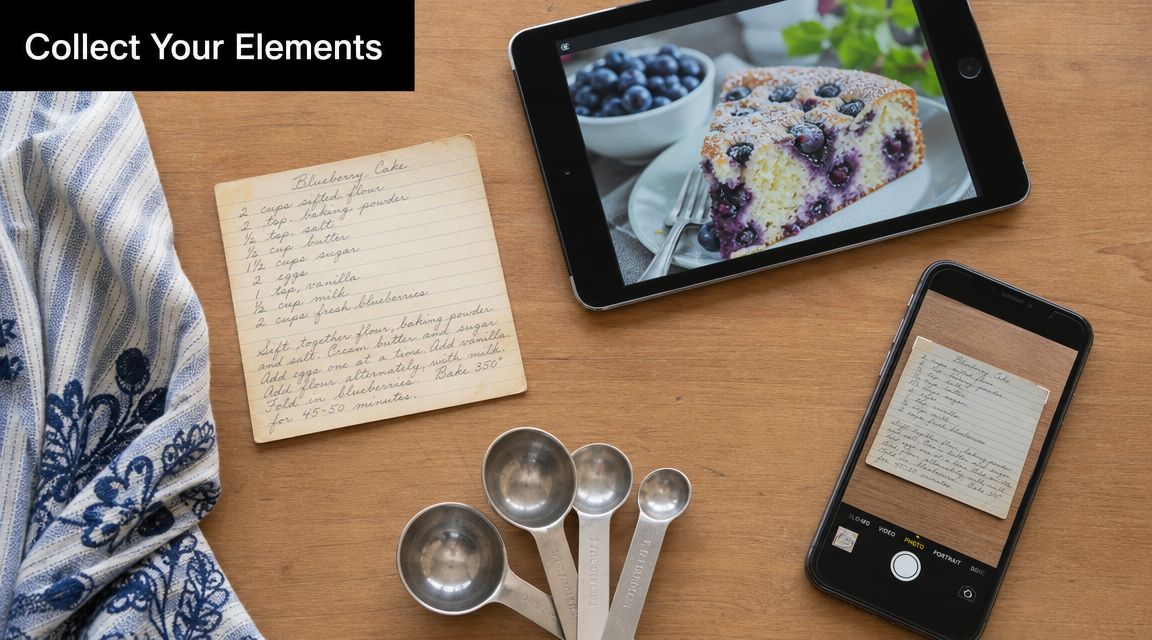
The strongest recipe covers usually come from a mix of old and new material. A grandmother's handwritten card. A recent photo of the cake everyone requests. A title pulled from the family nickname for the collection. Those pieces carry more weight than generic stock art.
One of the easiest mistakes is collecting assets too late. Then you're designing with whatever image is nearby instead of the one that fits the story of the book.
Pull from your real recipe history
A family collection gets better when the cover hints at what's inside. That might mean:
- A scanned recipe card: especially if the handwriting is recognizable
- A finished dish photo: best for a themed collection such as breads, cookies, or weeknight dinners
- A simple kitchen object: a mixing bowl, measuring spoons, or a flour-dusted table can work if the photo has breathing room
- A text-only cover: often the smartest choice when your archive includes many styles and no single image represents it well
If you're digitizing old cards first, a guide to using a photo scanner for Macs can save time and help preserve details that get lost in quick phone snaps.
Clean up assets before they hit the template
A cover image doesn't need to be fancy, but it does need to print cleanly. Blurry scans, dim overhead photos, and screenshots taken from social media often look acceptable on a phone and disappointing on paper.
Use this quick prep checklist:
- Crop with intention: Remove busy countertops, torn edges, or background clutter that steals attention.
- Keep the original version: Save an untouched copy before editing contrast or color.
- Check readability zones: If text will sit over the image, make sure one area has calmer visual space.
- Unify mixed materials: If your recipe card is warm-toned and your food photo is cool-toned, adjust them so they don't fight each other.
A cover doesn't need many ingredients. It needs the right ones.
If you don't have a suitable hero image yet, it can help to create graphics with PhotoMaxi AI for title treatments, simple backgrounds, or supporting visuals that don't overpower the cover.
Build from your digital library, not from scratch
A digital recipe organizer proves practical. If your recipe collection already includes photos, categorized dishes, and scanned cards, you can pull from what you've already preserved instead of hunting across camera rolls, cloud folders, and browser bookmarks. OrganizEat is one option for that. It lets you capture handwritten cards, cookbook pages, and web recipes, then keep them sorted so the cover reflects the same structure as the collection inside.
That connection matters. The cover should feel like the front door of your recipe archive, not a separate craft project.
Designing a Clear and Compelling Layout
A printable recipe book cover has one main job. It must stay readable in three situations: on your screen while editing, as a small preview, and in your hand near a stove. Many covers pass the first test and fail the other two.
The safest starting point is a clear hierarchy. People should notice the title first, then the subtitle or family name, then the image. If the photo overpowers the wording, the cover may look attractive but still feel unfinished.
A quick visual comparison helps when you're deciding how much is enough and how much is clutter.
Use one hero and one supporting voice
Most successful covers rely on one dominant element and one secondary one. That might be a food photo plus simple typography. Or bold text plus a subtle background pattern. Problems start when every element tries to be the star.
Design guidance for cookbook covers consistently recommends a high-resolution hero image, negative space, strong contrast between typography and background, and a clean layout so the title and author name don't compete with the food photo, according to Dochipo's cookbook cover design guidance.
That advice matters even more for home recipe collections because home cooks often choose very emotional images. The pie from Thanksgiving. The cake from a birthday. The stained handwritten note. Those are meaningful, but they still need room for text.
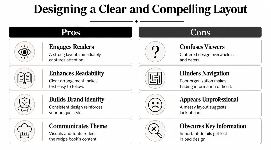
What usually works and what usually doesn't
Here's the trade-off table I come back to most often:
| Works well | Usually disappoints |
|---|---|
| One strong photo with empty space | Multiple photos squeezed into a collage |
| Two fonts at most | Several decorative fonts competing |
| Dark text on light calm areas, or the reverse | Text over patterned or detailed food surfaces |
| Short title on the spine | Script font running vertically on a narrow spine |
A useful test is the thumbnail test. Shrink the cover on your screen until it's small. If the title vanishes or the image turns muddy, simplify.
This walkthrough can help you think through composition choices in motion:
Give food photography somewhere to breathe
Food images create a specific design challenge. A pasta bowl, frosted cake, or casserole often fills the frame with texture. That looks delicious, but it leaves nowhere for words to sit.
Try these layout fixes:
- Pull back the crop: Show slightly more table or background so the title has room.
- Place the dish off-center: This creates natural empty space on one side.
- Add a soft overlay: A subtle darkening or lightening layer can improve contrast without ruining the photo.
- Cut ornaments first: Borders, flourishes, and badges should be the first things removed if the cover feels crowded.
The cover should look good from across the kitchen. Not just from two inches away on your laptop.
Overcrowding is one of the most common pitfalls because people keep adding “nice touches” after the layout already works. Stop earlier than you think. Recipe books look better when the design leaves something unsaid.
Finalizing Technical Specs for Printing
A polished layout can still print badly if the file setup is loose. Text creeps too close to the edge. Backgrounds stop short and leave white slivers. A spine title drifts. These aren't design failures. They're production failures.
The easiest way to avoid them is to separate three areas in your file from the start: bleed, trim, and safe area.
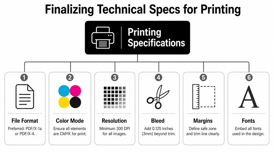
Know where each element belongs
Use this simple guide:
| Print term | What it means | Why it matters |
|---|---|---|
| Bleed | Extra background area beyond the final cut line | Prevents accidental white edges |
| Trim | The final cut size | Defines the actual finished cover |
| Safe area | Inner zone where important text should stay | Protects titles and details from looking crowded or clipped |
For home projects, ask your print shop or template provider what setup they expect before exporting. If they give you a cover template, use it. Freehand guessing usually causes more trouble than the design itself.
Check images, fonts, and file format
Technical cleanup is mostly boring, which is why people rush it. Don't.
Run this pre-export list:
- Images: Make sure they stay sharp at print size. If you need help fixing file resolution, this guide on how to change image DPI without blurring is useful.
- Fonts: Embed them when exporting so substitutions don't change your layout.
- Backgrounds: Extend full-bleed color or image areas beyond the trim edge.
- Spine alignment: Recheck vertical centering before exporting the final file.
Print check: If a title feels too close to the edge on screen, it will feel even closer once it's printed and inserted into a binder sleeve.
For binder covers, also remember the plastic sleeve itself changes how edges look. Slight trimming variation is normal. That's another reason to keep essential text comfortably inward rather than pushing it toward the border for a “full” look.
Exporting, Printing, and Assembling Your Book
This stage decides whether your printable recipe book cover becomes a flexible household tool or a finished keepsake. Both are valid. The wrong choice is using a format that fights the way you cook.
Compare your printing route
Home printing gives you speed and control. You can test cardstock, replace a damaged front cover quickly, and tweak colors after one sample. The trade-off is consistency. Some home printers handle photos poorly, and heavier paper can curl or jam.
A local print shop usually gives cleaner color, better paper handling, and easier trimming. It's the better choice if you want a cover with a sturdier feel or if the design includes a full-bleed image. Online platforms can also work well if you already have a print-ready PDF and know the exact format you want.
If your project may eventually become something more formal, a guide to KDP printable cover setup is useful for understanding how print-oriented cover files are structured, even if you're starting with a family binder.
Match the binding to the real job
Different formats solve different problems:
- Three-ring binder: Best if the collection will grow, recipes get swapped often, and dividers matter.
- Spiral or coil bound: Great for lay-flat cooking and giftable projects with a fixed set of pages.
- Perfect-bound book: Looks polished, but it's less forgiving if you want to add or reorganize content later.
I usually tell people to choose the binder if they're still actively collecting recipes. It's more practical in daily use and easier to rebuild after spills, torn pages, or seasonal changes.
Assemble for kitchen life, not shelf styling
Once the cover is printed, finish the system properly. Slide it into a clear binder sleeve if the binder supports one. Add the spine insert before you load all the interior pages. Use section dividers that match the cover style, even if the design is simple.
For families building a shared archive, a shared family recipe album with OrganizEat can help organize the digital side before you decide what belongs in print. That keeps the physical book focused on the recipes you want at hand.
Before calling it done, print one test copy and check three things: readability from arm's length, color under kitchen lighting, and whether the spine still reads clearly once the binder is full.
Frequently Asked Questions About Recipe Book Covers
Do I need expensive design software
Usually, no. Free template platforms have made this much easier. The mass availability of customizable templates on major platforms means you don't need to be a professional designer to build a solid print-ready cover quickly, as shown by Canva's dedicated recipe book cover library.
What paper works best for a kitchen binder cover
A heavier paper or cardstock usually feels better than standard printer paper for the front insert. If the binder has a clear outer sleeve, the plastic does a lot of the protective work. If it doesn't, lamination or a protective sheet helps.
Should I laminate the cover
If the cover will be handled often and stored near the cooking area, lamination or a clear sleeve is worth it. If the binder already has an exterior pocket, don't laminate first unless you've checked the fit. Some laminated covers become too stiff for snug sleeves.
What should go on the spine
Keep it short. Use the title or family name, and maybe one category if you have multiple binders. Tiny script fonts usually disappear on narrow spines.
What belongs on the back cover
Less than one might assume. A simple pattern, a short family note, a date, or a blank coordinated back often looks cleaner than trying to fill every inch.
What's the biggest mistake people make
Treating the cover like a poster instead of part of a working kitchen system. A good printable recipe book cover should survive handling, match the interior structure, and help you find the right binder fast.
If your recipes are still scattered across social posts, screenshots, handwritten cards, and browser tabs, OrganizEat gives you a practical place to collect them before you print anything. You can save recipes from the web, snap old cards, keep categories tidy, and turn a messy archive into a recipe book that's easier to design, print, update, and share with family.